The problem
The practical question behind this dashboard: who should an advising team reach out to, and when? Outreach capacity is limited, so it helps to know both which students are at risk and which signals show up early enough to act on.
The data
A public dataset of 4,424 higher-education students, each tracked from enrollment to the end of their program. It includes:
- Known at enrollment: age, gender, course, scholarship status and tuition status
- Early academic performance: first- and second-semester results
- Final outcome: graduated, still enrolled or dropped out
Source: Higher Education Predictors of Student Retention (Kaggle).
The dashboard
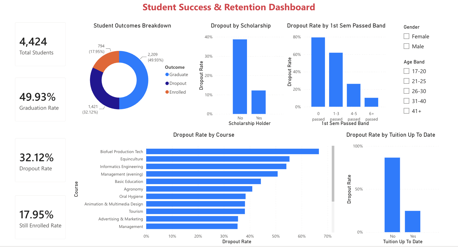
| Visual | What it answers |
|---|---|
| Summary cards | Total students, graduation, dropout and still-enrolled rates |
| Outcomes breakdown | The overall split of graduates, dropouts and enrolled students |
| Dropout by scholarship | Do scholarship holders drop out less? |
| Dropout by 1st-semester units passed | How early performance relates to dropout (the clearest early-warning view) |
| Dropout by tuition status | Students current on tuition vs those who have fallen behind |
| Dropout by course | Which programs carry the most risk |
What it shows
- Early performance is the strongest signal. Students who pass no units in their first semester drop out around 80% of the time, falling to about 10% for those who pass six or more.
- Financial factors matter. Students behind on tuition drop out at roughly 87%, versus 25% for those who are current, and non-scholarship students drop out far more than scholarship holders.
- Risk is concentrated. A handful of programs have much higher dropout than the rest.
What to do about it
Financial factors identify who to watch. First-semester performance shows who needs help right now.
Because early performance is visible so soon, it's a practical trigger for proactive outreach: flag students who are struggling in their first term for advising, tutoring or a check-in before they leave.