All case studies

Graduate project · Tableau

How U.S. airfares shifted, 2018 to 2024

Using BTS airfare data at airport, city and state level, I looked at how fares and passenger volume moved before and after the pandemic, and how much of the change inflation hides.

Timeline
Sep 2024 – Dec 2024
Data
BTS airfare data, 2018–2024
Level
Airport, city and state
Tools
Tableau, SQL, Python, Excel
11interactive Tableau visualizations
7 yearsof fares, 2018 through 2024
Nominal + realfares normalized for inflation

The question

Airfares dropped during the pandemic and then came back, but by how much, where, and what does it look like once you account for inflation?

Approach

  • Cleaned and prepared airport-, city- and state-level fare data from the Bureau of Transportation Statistics (BTS) with SQL, Python and Excel.
  • Normalized fares into both nominal and inflation-adjusted terms, so real changes could be separated from price-level effects.
  • Built 11 interactive Tableau visualizations, including state-level choropleth maps (Mapbox, OpenStreetMap) such as "Hidden Inflation Impact" and "How U.S. Airfares Shifted, 2018–19 vs 2024."

Overview
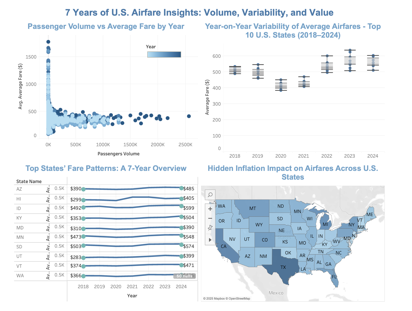
Four Tableau charts: passenger volume vs average fare by year, year-on-year fare variability for the top 10 states, top states' fare patterns from 2018 to 2024, and a U.S. choropleth map of hidden inflation impact on airfares
Four of the eleven views: volume vs fare, year-on-year variability across the top 10 states, state fare patterns, and the inflation-impact map.

Across the top 10 states, average fares dipped in 2020–21 and then climbed above their 2018–19 levels from 2022 onward.

Live visualizations

Both views are interactive: hover, filter and click through. On a phone, they're easier to explore in Tableau Public.

Pre- vs post-pandemic airfare trendsOpen in Tableau Public

Interactive Tableau view. It loads from Tableau Public.

2018–2024 airfare overviewOpen in Tableau Public

Interactive Tableau view. It loads from Tableau Public.